
Did You Know We Spend a Full Work Week Learning Your Business Before We Build?
Most People Don’t Browse Websites Like They’re Doing Research for a Thesis
They’re human.
They’re thinking about what they forgot at the store, what their kid needs for tomorrow, whether they’ll make it to the gym, what’s for lunch, what that meeting is going to be like, and how many tabs are already open.
Then they land on your website.
And you have a tiny window to make them feel something real. Clarity. Confidence. Curiosity. Relief. Anything other than, "I don’t get it, I’ll come back later."
That’s why Bright Cloud Studio does something that surprises a lot of people.
Before we write a single line of code, we invest what often equates to a full 40-hour work week learning your business. Not because we love homework. Because the details matter that much.
If we don’t understand how your business works, who you’re trying to reach, and why people choose you, then a website turns into a pretty shell. It might look fine, but it won’t do the job.
Why This Matters More Than You Think
A website is not a brochure. It’s not a portfolio. It’s not a digital business card.
It’s a decision point.
It’s the place people go when they’re trying to figure out:
- Am I in the right place?
- Can these people actually help me?
- Do I trust them?
- What do I do next?
If your site doesn’t answer those questions quickly, people don’t get angry. They just leave. Quietly.
And if your business has more than one audience, that problem gets worse. Because now your site has to guide different people to different answers without making the experience feel messy or confusing.
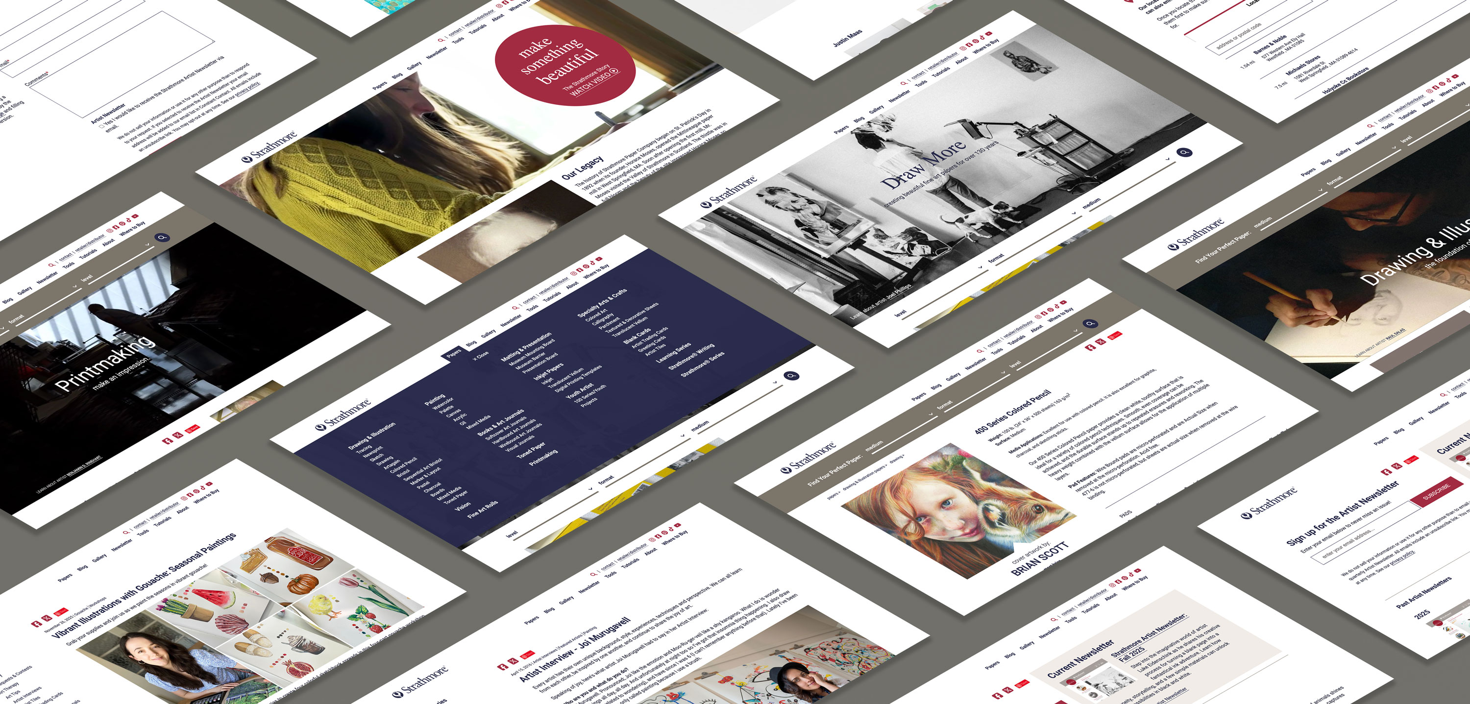
That was exactly the situation with Strathmore®.
Strathmore’s Problem Was Not That They Lacked a Great Brand
Strathmore is a historic fine art paper manufacturer with a deep love for artists. They make high-quality papers, pads, and journals that support creators at every stage, from beginners to seasoned professionals. Many people on the Strathmore team are artists themselves, which makes their connection to the creative community more than marketing, it’s cultural.
But their website didn’t fully feel like that.
It felt overly corporate.
And if you’re reading this thinking, that sounds familiar, it probably is. A lot of manufacturers and legacy brands end up there without meaning to. The business grows, the site grows, the stakeholders multiply, and suddenly the website feels like it was built to check boxes instead of connect with real people.
The Real Challenge Was Serving More Than One Audience Without Splitting the Brand
Strathmore sells primarily through distributors and retailers. That channel matters.
At the same time, the heart of the brand lives with the artists who use the paper, talk about it, share it, and build demand for it.
So Strathmore had a tough balance to strike.
They wanted to:
- Drive stronger demand and connection at the consumer level
- Inspire artists without alienating distributors and retailers
- Support a growing product line of artist journals and papers
- Become more visible and relevant within the artist community
This is where most web projects go sideways.
Because if you skip discovery, you end up designing based on opinions. Somebody wants the homepage to do one thing, someone else wants it to do another, and the end result is a site that tries to please everyone and convinces no one.
What We Uncovered During Discovery
Discovery is where we stop guessing and start seeing the real picture.
Through the discovery process, several key insights emerged:
Artists needed to be front and center immediately when they landed on the site. Inspiration and real artwork needed to lead, not follow. Artists needed help understanding paper quality levels and choosing the right products. The homepage needed to flex easily to highlight new products, inspiration, and events. The site also needed to act as a hub for traffic coming from social media.
At its core, the website needed to feel like it was built for artists, not just about products.
That one sentence became a filter for every decision after it.
What We Actually Did, in Plain Language
Once discovery clarified what the site needed to do and who it needed to serve, the build became focused.
Bright Cloud Studio worked closely with Sara and the Strathmore team through collaborative sessions to define the structure, tools, and user flows.
Our process included:
- Mapping visitor journeys for both product-focused and inspiration-driven users
- Creating wireframes that clarified architecture and content hierarchy
- Developing mood boards and reviewing art-focused websites inside and outside the industry
- Designing with restraint so the artwork and artists stayed the focal point
- Honoring Strathmore’s historic brand while ensuring long-term design longevity
That “designing with restraint” piece matters. When the work is visual, the site should not compete with it. It should frame it.

The Results Were Not Just Visual, They Were Behavioral
The redesigned website delivered meaningful outcomes.
Increased engagement with artists across the site. Growth in professional relationships with featured artists. A significant increase in artist newsletter subscriptions. Increased site traffic and on-site engagement. Strong internal adoption and enthusiasm from the Strathmore team.
Most importantly, the site became a living extension of Strathmore’s passion for artists.
That’s the real goal. A website that feels like the brand, supports the business, and makes it easier for the right people to connect.
A Quick Takeaway You Can Steal
If your website serves multiple audiences, it's not just about adding "more pages", it's about finding clarity and having the right pages.
Clarity about who you’re speaking to first, what they need in that moment, and what the next step should be.
That’s why we start with discovery, and why we’re willing to put a full week into learning before building.
Because websites don’t fail when they look outdated. They fail when they feel unclear.
See How Your Site Looks in 10 Seconds
If you're curious what people see in the first 10 seconds of visiting your site. Check out our Mobile Readiness: The 10-Second Test blog to do a quick check and spot friction fast.